
How to Create a YouTube Thumbnail: 7 Visual Architecture Rules for Educational Creators
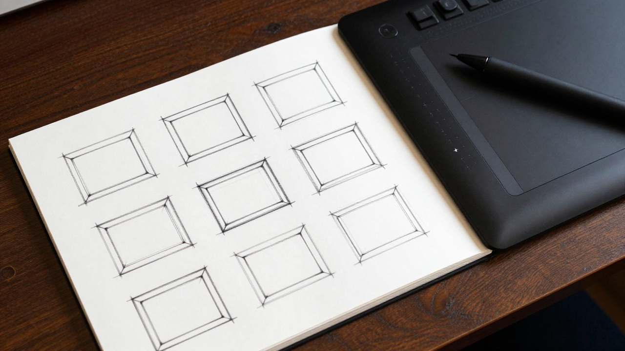
Click-through rate is determined by visual clarity, not chaotic clickbait. Master the 7 tactile framing rules that establish instant credibility and maximize high-retention clicks.
The 3-Element Visual Rule
Cluttered thumbnails fail on mobile viewports. Limit the composition strictly to three visual focal points: one focal human or subject, one clear contrasting element, and one spatial context.
Inspect your canvas at 10% scale or 150px width; if the primary concept cannot be recognized within 400 milliseconds, remove secondary props.
Luminance Contrast over Color Saturation
Novice creators oversaturate colors until skin tones look nuclear. High-converting thumbnails rely on clear tonal values: a bright focal subject against a deep, controlled background.
Apply a temporary black-and-white adjustment layer; ensure a minimum 3:1 luminance contrast ratio between the central subject and background elements.
Facial Expression Micro-Targeting
Exaggerated open-mouth faces alienate serious adult learners. Professional educators should convey intense curiosity, diagnostic focus, or calm authority.
Photograph your facial assets under 45-degree key lighting with an eye-line directed precisely toward the thumbnail's secondary visual problem.
The Negative Space Safe Zone
YouTube UI elements obscure crucial thumbnail real estate. The bottom-right corner holds the timestamp overlay, while the bottom margin hides beneath progress bars.
Keep the bottom 25% and entire right-hand edge completely free of essential storytelling details or critical visual focal points.
Visual Hierarchy Gap Theory
The thumbnail must complete a visual sentence begun by the video title. Never repeat the exact video title text inside the graphic; present the unanswered question visually.
If the title is 'How to Build a Custom Desk', the thumbnail should show a single precision wood joint undergoing an impossible stress test.
A/B Testing Against Real Competitor Grids
Testing a thumbnail against a blank white canvas produces false confidence. Preview your candidate artwork mocked up directly inside an active search results grid.
Use YouTube Thumbnail Preview extensions to test 3 visual candidate options surrounded by real competing videos in your niche.
Tangible Physical Artefact Anchors
Thumbnails showing physical workbooks, instructional card decks, or tangible blueprints consistently outperform generic digital software screenshots.
Photograph yourself holding a co-created Peer Wright workshop deck or physical curriculum binder as the primary foreground anchor.